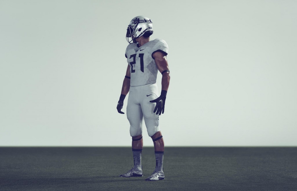
Earlier this week we got our first glimpse of the brand new uniforms the Oregon Ducks will be wearing this weekend. This week Oregon will be wearing a unfirm that is inspired by none other than Lewis and Clark.
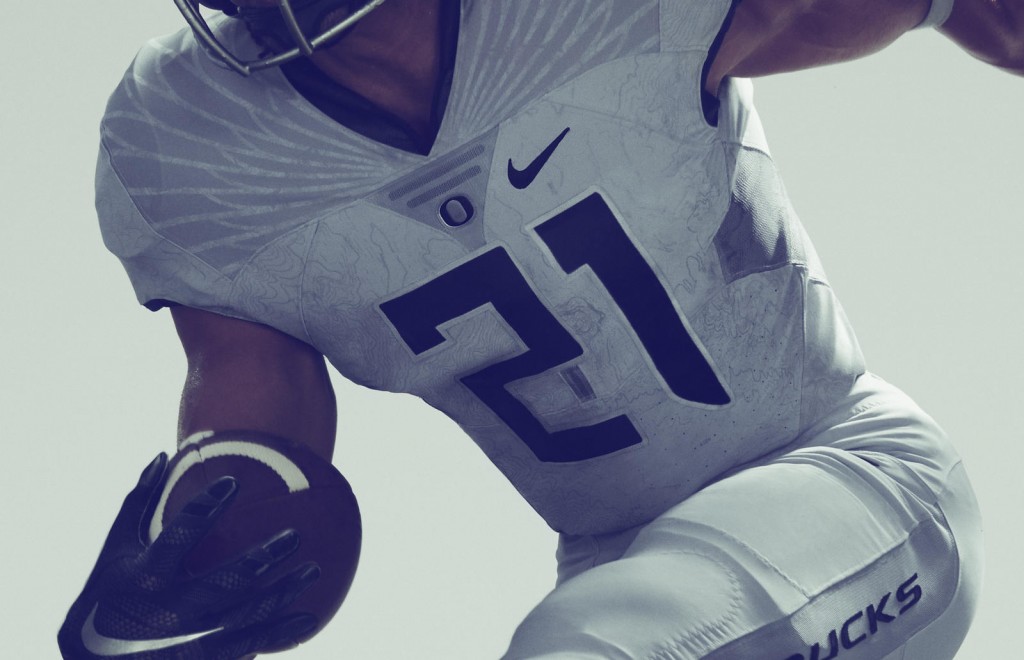
Let’s take a closer look at the uniform. First, a closer look at the jersey itself, where some very intricate details can be shown.
At first glance it would appear Oregon’s uniform is simply a nice shade of silver or gray with the signature feathered wings on the shoulders. But look a little more closely and you can see the design and pattern of the jersey is actually a topographical map of the state of Oregon. That is some fancy design at work, but it gets better. Each player’s uniform will contain a different section of the map, thus making each player’s uniform a 1-of-1. I know I would love to see the uniforms all sewn together to make the complete map, numbers and all. That makes this one of the most unique alternate uniforms we have ever seen make it to the football field.
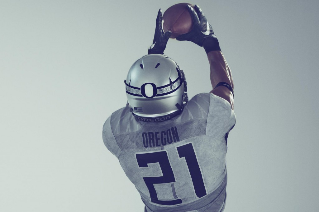
Let’s take a look at the back…
As you can see, the same topographical map concept continues on the back of the jersey, with the dark numbers outlined in a silver tone. What stands out here is the back of the helmet (I’ll get to the sides of the helmet next). The trademark Oregon “O” is in the middle, with the American flag placed on the bottom left of the helmet. But that’s not just any regular old American flag. That is actually the 33-star state flag, honoring the acceptance of the state of Oregon into the United States in 1859.
The line across the back of the helmet, with the Oregon “O” in the middle, depicts the 2,200-mile Oregon Trail — the actual journey and exhibition, not the classic computer game.
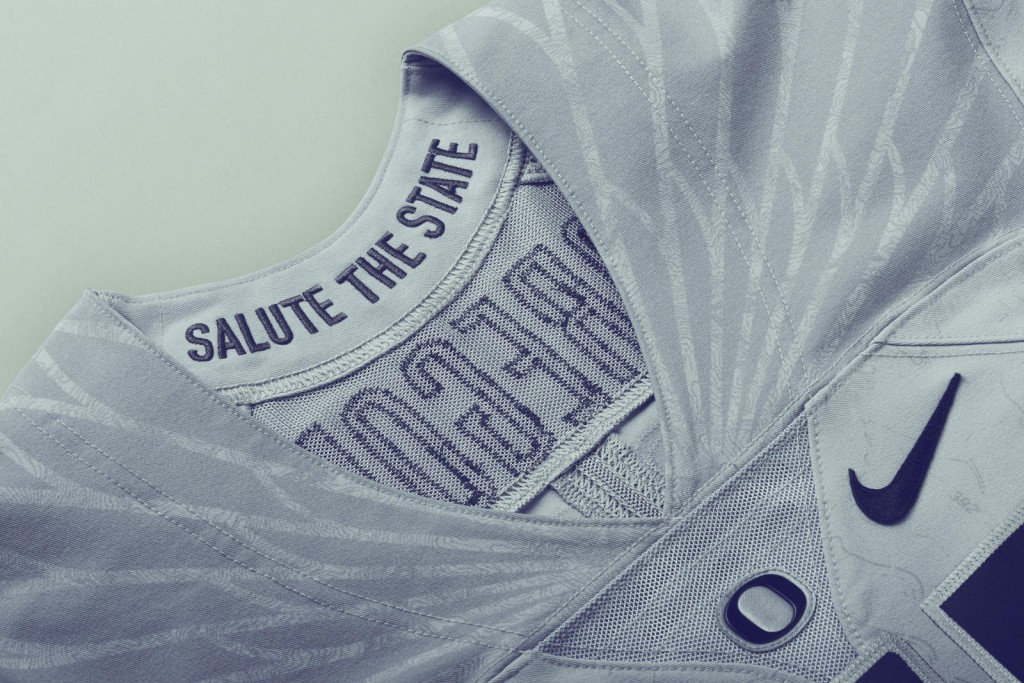
Apparel companies have been taking advantage of every little inch of a uniform lately to offer something unique to each school. One of the more popular parts of the uniform to do this has been the inside of the collar on the jersey. This Oregon uniform continues that trend with a “Salute the State” inscribed on the inside of the collar. It is one of those uniform features that will never be seen when worn, but it’s there.
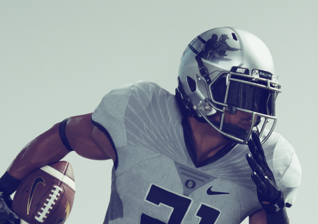
I put it off long enough, so let’s move to this week’s helmet logo. As you saw above, the Oregon “O” is on the back of the helmet, which leaves the side open for creative design. Silhouettes of Lewis & Clark are joined by a silhouette of the Oregon Duck, with the three looking off into the distance and pointing forward.
This is not the first time we have seen a football uniform used to honor some local history. Maryland, a program seemingly attempting to emulate Oregon’s uniform strategies with Nike with their own apparel partner (Under Armour) actually beat the Ducks to the punch with this one. Last year Maryland suited up for a game wearing a uniform designed specifically for honoring the 200th anniversary of The Star-Spangled Banner. Personally, I think Maryland did a better job with honoring some local history (The Star-Spangled Banner was written in Baltimore, of course), but Oregon and Nike did a remarkable job blending Lewis & Clark with Oregon’s trademark looks. Maybe Oregon has jumped a shark with alternate uniforms, but that does not prevent me from wanting to know just what ideas are still being designed.

