When I watch a college basketball game, I’m not one of those people who pays much attention to who is announcing the game, what the scorebug on the TV looks like, or most other aesthetics. However, one thing I do love to see is the different court designs. Perhaps that’s why I hate how the NCAA tournament has gone with a homogenous court design that is not only boring, but terrible. “Stepford courts” are the worst.
The great thing about college basketball, though, is that even when the court designs are terrible, they’re at least interesting and different. I won’t pretend to have seen every court, but here are my favorites (note: not really in any order).
1. Arena Auditorium (University of Wyoming)

Arena Auditorium
Some of this is because of the aesthetic of the entire place, but I love this court. A lot of people come down on bigger center court logos, but I really like them (more on this later), and the contrast between inside the arc and outside the arc is great, as is the fact that the paint is actually made up of, you know, paint.
In all, it’s a great court that blends classic and modern looks to form probably my favorite in the nation.
2. Assembly Hall (Indiana)

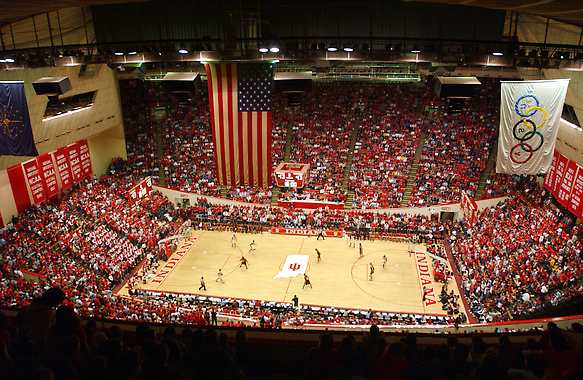
Assembly Hall
The gold standard for classic court designs is Assembly Hall in Bloomington. Although the Hoosiers have fallen on hard times in the last couple seasons, Assembly Hall remains great. This is one of the few places where having every color on the floor (except the center court logo) the same color works. Usually I’m a fan of contrast between the lane and outside the lane, but Indiana nails it here. It’s also worth noting that in general I am a big fan of states as center court logos (again, more on that later).
3. Allen Fieldhouse (Kansas)

Allen Fieldhouse (Copyright Gregg Riess Photography, LLC)
Allen Fieldhouse is another place that definitely benefits from its all-around aesthetics and atmosphere, not to mention the history you can feel in the building. The giant bird logo catches some heat, and a lot of people did like the center court logo more when it was the state, but the logo is one of the coolest in all of sports, so I don’t blame the Jayhawks for taking advantage. Kansas gets extra bonus points for being able to name its court after the inventor of the game – and first coach in school history – James Naismith.
4. Carver Hawkeye Arena (Iowa)

Carver Hawkeye Arena
Carver Hawkeye Arena is one of my favorite arenas in the entire country, mostly due to the way it looks so small and unimpressive on the outside, but is carved into the ground. Moreover, because it’s just one bowl, there is not a bad seat in the house. As for the court, the checkerboard parquet pattern is excellent, the black and gold combo is great, and Iowa has one of the best logos in the country. Keep on keepin’ on, Hawkeyes.
5. The Palestra (Pennsylania)

The Palestra
The Palestra probably has the weakest court design of any arena on the list, but it is the freaking Palestra, so I’ll let it slide. The Palestra is one of the oldest basketball arenas in the world, has hosted more NCAA tournament games than any arena (and it’s a shame the tournament hasn’t been there recently, though I get why it hasn’t…) and is an absolute jewel of the sport.
6. Coleman Coliseum (Alabama)

Coleman Coliseum
The Crimson Tide football team is known for its clean, classic uniforms, and the basketball team executes that idea to a T with this court. Most notably, Alabama uses the classic A logo rather than anything to do with the elephant (which isn’t bad, but doesn’t really fit on a basketball court).
7. CFE Arena (UCF)

CFE Arena
Of all of the newer court designs, CFE Arena is by far my favorite. I honestly wish the entire court, save the lanes, could be that grey color to give the feel that the Knights were playing on a blacktop surface.
8. Dahlberg Arena (Montana)

Dahlberg Arena
The Grizzlies get docked a bit for having the name of the school and the nickname on the court, but a lot of schools use it as filler so I’ll let it slide. Where the court really grabs me, though, is the grizzly paw in the lane and the giant bear at center court. I’m not going to argue with a giant bear.

